Note-Taking Application ✏️
- Category: Design Challenge
- Project Date: June 2020
- Challenge:
- How would you design an app for taking notes in class? Share your thought process and design mockups. Make sure to state your assumptions.
- Project:
- Full Design Challenge Document/Write-Up
Summary
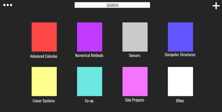
- This design challenge was very open ended and really challenged us to put emphasis on our thought process and show how we navigated through an open ended problem. In this challenge, I designed and created a wireframe and visual mockup of a note-taking app for taking notes in class. The assumptions I made before starting the designing of this app are is that the user is taking notes on a laptop/tablet with a tablet pen and that the laptop/tablet is a touch screen device that is connected to the internet.
Process
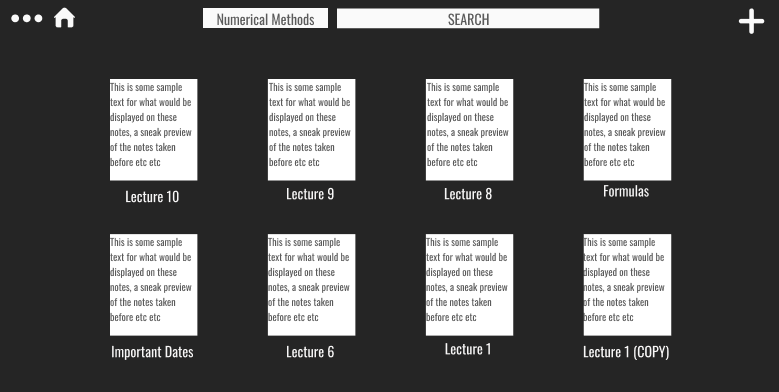
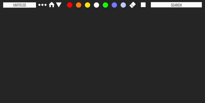
- The process I followed was to create an analogy to base the app design off of. I thought about how I would want to navigate through this app from beginning to end as if I was a user and what I would want to see throughout the process. I started by creating the opening screen that would be seen upon launching the application. Through the starting process, I thought about how this would be similar to looking through a backpack for a notebook, but instead, through an app interface. Similar to looking through a backpack, I would want all the notebooks I have used recently to be easily seen and accessible. Unlike a backpack, an app for note-taking has the ability to be organized every time it is opened. Therefore, this screen needs to be organized, easy to navigate, simple, and intuitive. By following this analogy, I was able to lay out what the user flow would look like.
Key Learnings
- how to use Figma to develop a solution with open ended possibilities
- how to differentiate between a need and a feature
- how to use build an intuitive user flow as a potential user
- how to wireframe and ideate within a short time span and limited resources
- open ended problems often means lots of potential for ideas and more complicated user interactions
Improvements
- more thoughtful use of UI and useablility (It's ugly... there is no use of UI components, branding, or anything that is visually pleasing)
- need to layout the most viable product before analyzing all potential features
- design a more user friendly layout and put more consideration to typography components (UI is 'childish' and unprofessional)
- more consideration for colour scheming, branding, and visual aesthetic